7 Color Palettes For Your Engagement Session
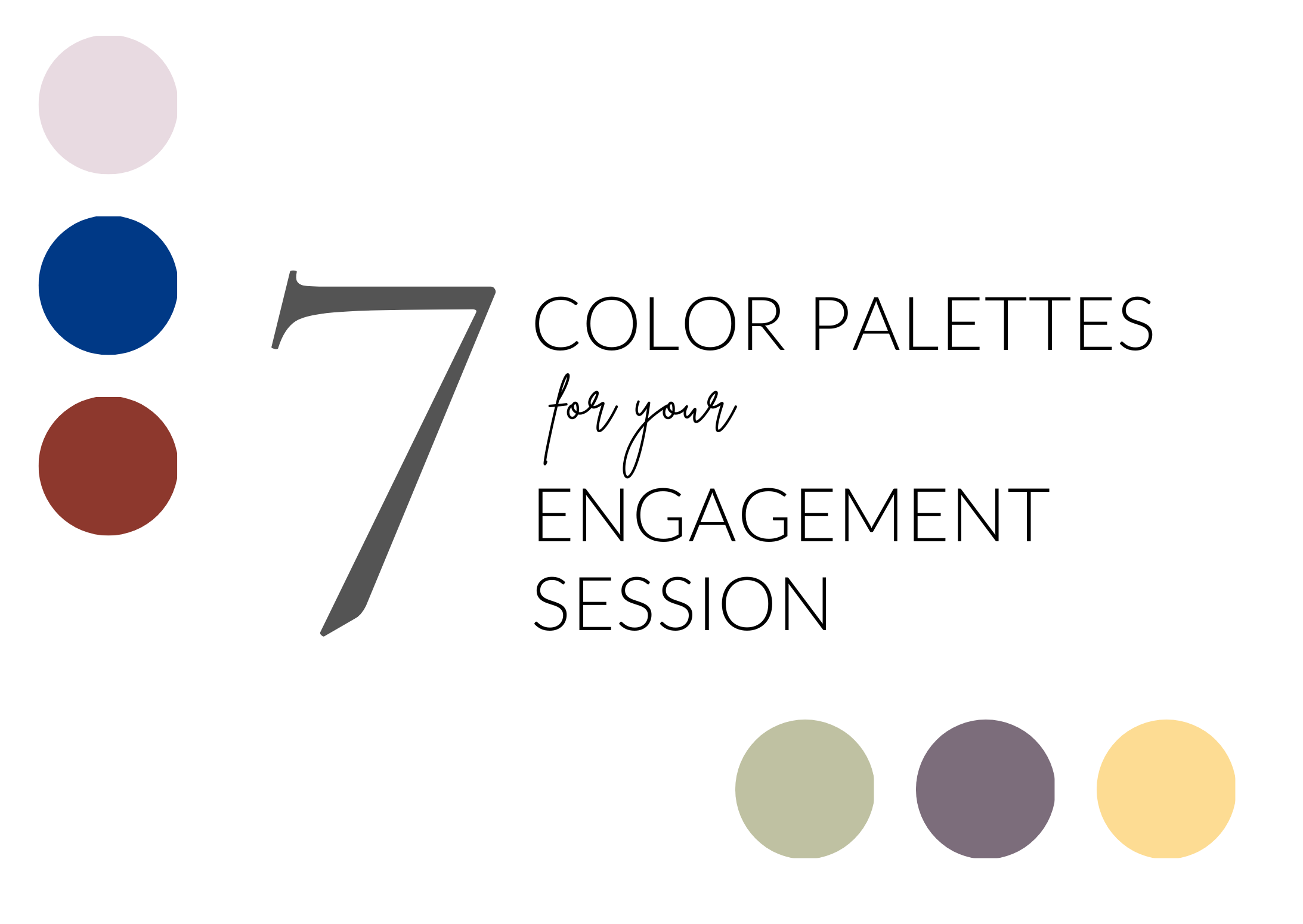
Coordinating colors and tones
These 7 color palettes for your engagement session will hopefully help to inspire and create a beautiful aesthetic when your session rolls around. Choosing what to wear for your engagement session can be a headache, especially if you aren’t a color coordinated person. You want to look so good in your photos that when anyone sees them you look like you were professionally styled by a designer.
Your session location and time of year are things to consider when planning for your shoot. To create an aesthetic appeal to your photos, choosing a color scheme rather than a main color will help make them look not as “matchy”, and lend to a more coordinated look. One thing to avoid is bright neon colors, like orange and pink. Bright neon colors distract the viewer from where the attention needs to be, on the people, not the articles of clothing.
An example of this would be pairing an soft blue dress with the guy’s white shirt and kaki pants. Or on the bolder scale, a red dress paired with the guys soft gray shirt and navy blue pants.
Whenever you have any doubts about colors, remember the camera loves neutral colors and jeweled tones. So rather than choosing a bright green top, a deep forest green or soft sage or olive green is better. Opt for a wine or crimson color than a bright red or purple.
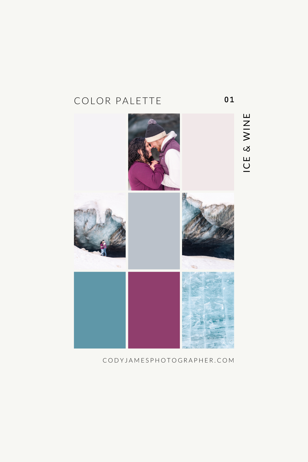
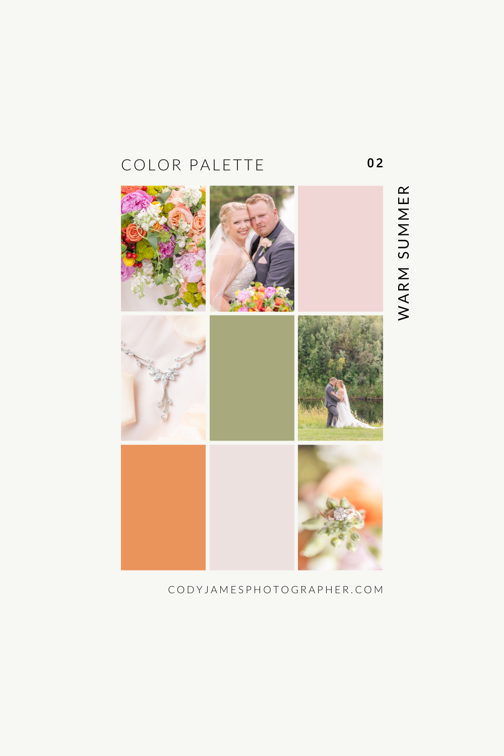
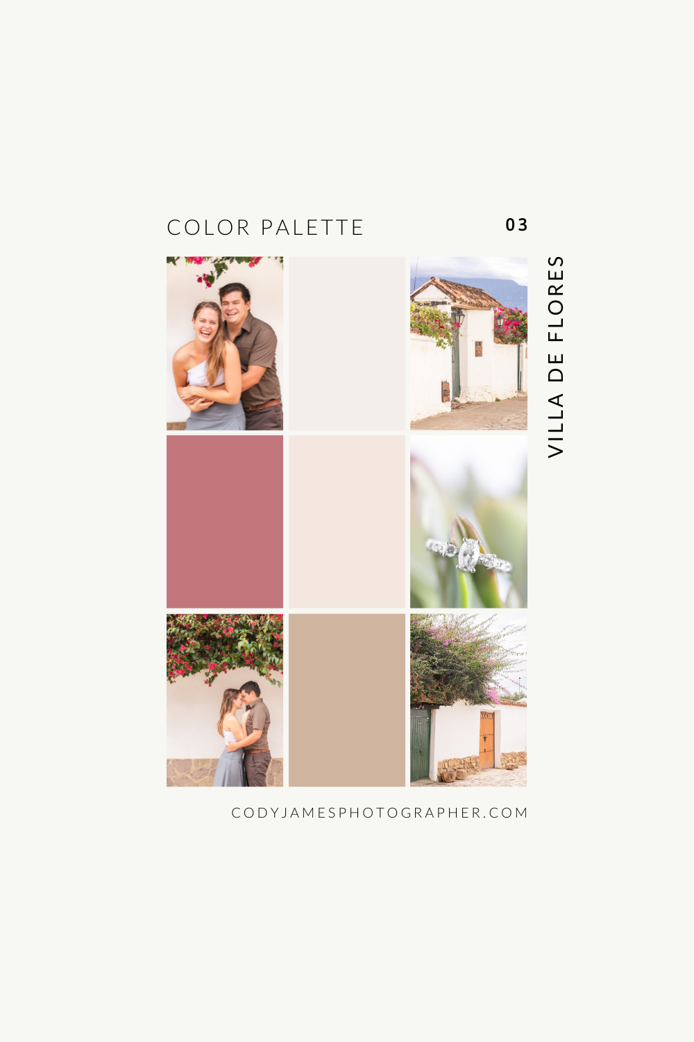
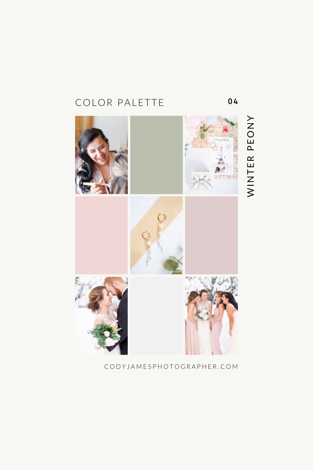
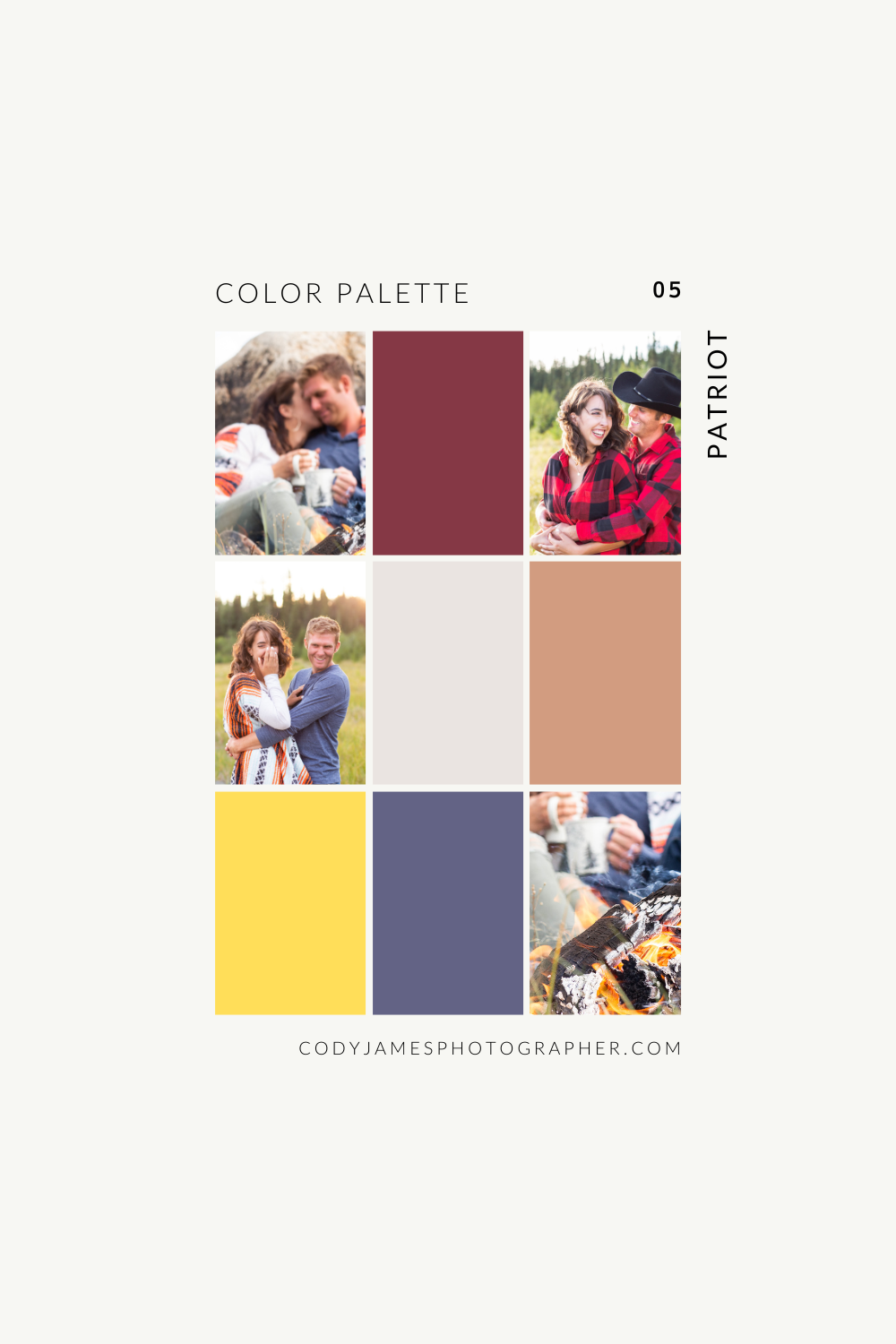
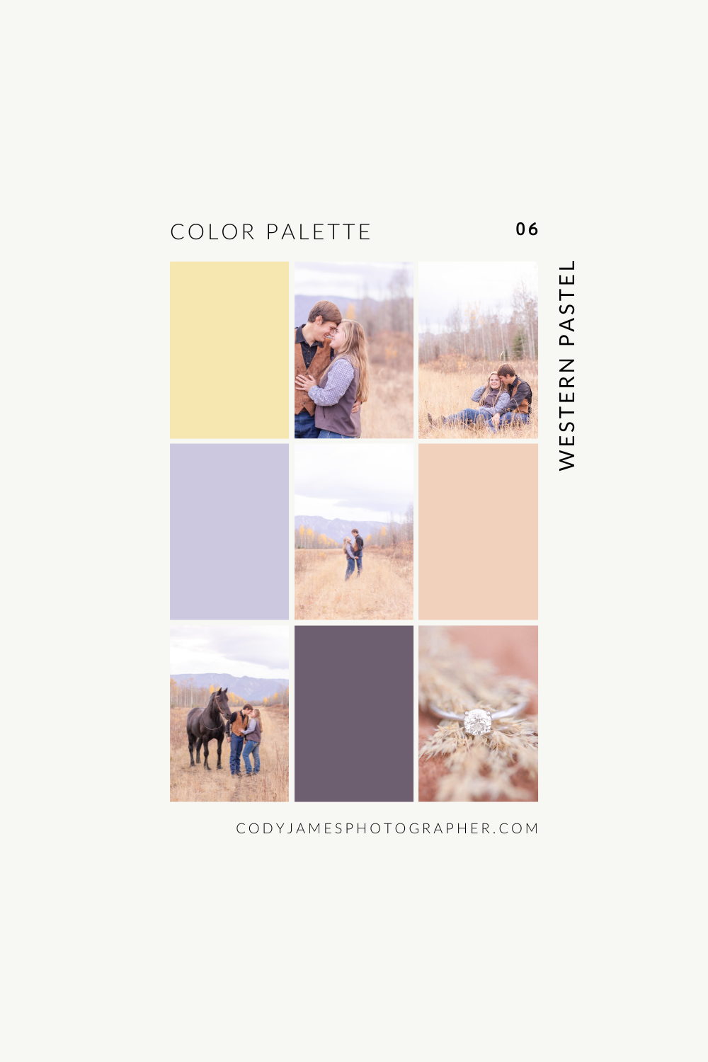
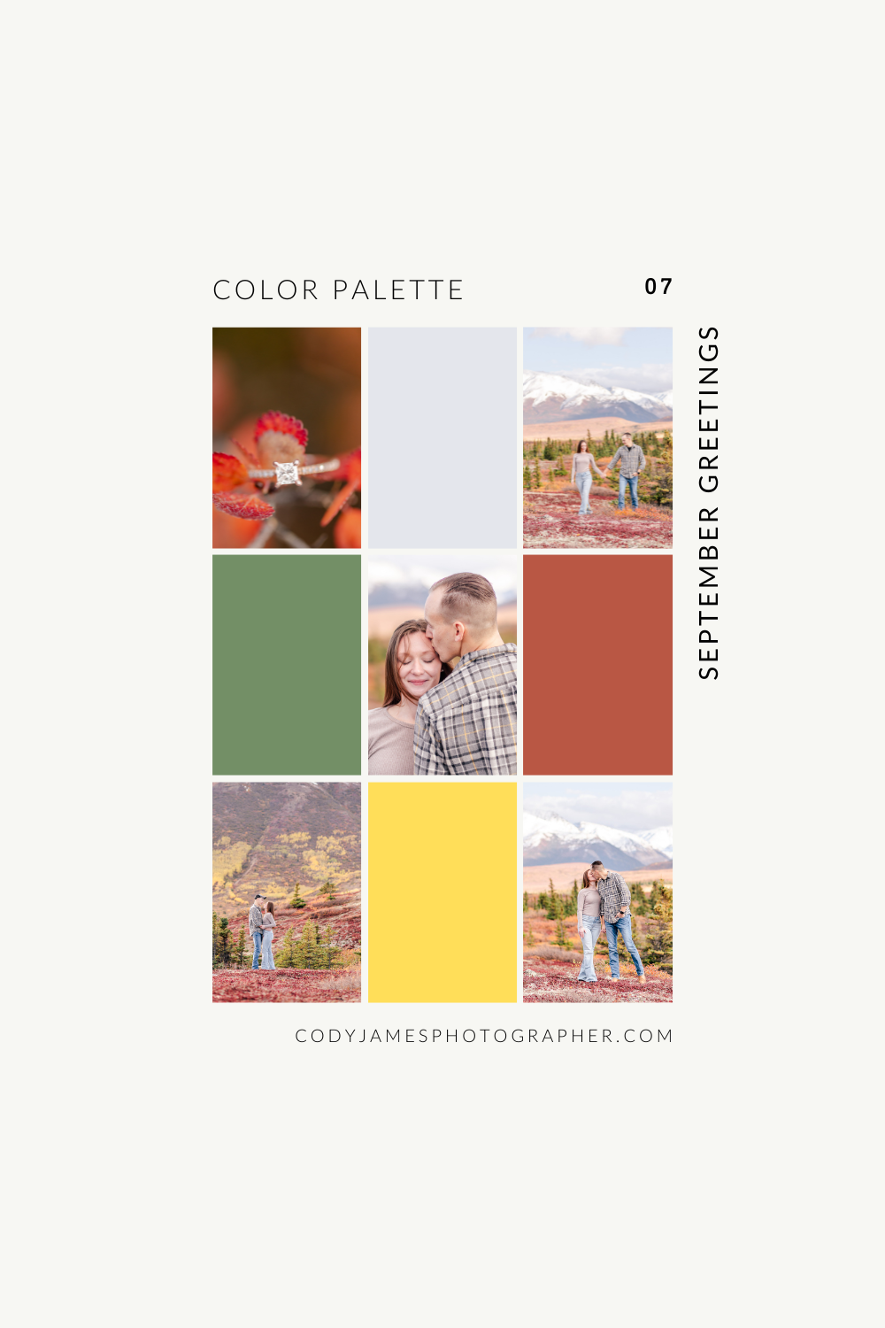
Hopefully this helps to give you an idea of how to elevate the look of your photos by coordinating rather than matching. Again, your colors will reflect you as a person and your style as a couple.
Happy Planning!
Add a comment